
Stop the presses! Nokia took some time out of their busy litigation schedule to design a new font.
This is what the Finnish-based company had to say about their new font in an extensive blogpost detailing the creation of Nokia Pure:
For a brand like Nokia, looking to reinvent and revitalise, the typeface literally sets the tone. In many ways, it’s the touchstone for every other visual element in the branding palette. So it needs to be considered, rigorous and send out exactly the right message.
Logically enough, the starting point for our brand new typeface, Nokia Pure, was also on-screen legibility at small sizes – although now we’re talking about the pin-sharp colour screens of contemporary smartphones. At the same time, we also needed a recognisable corporate typeface, versatile enough to work well in all manner of different environments – from other screen-based formats, to a whole host of printed materials.
Our in-house team started developing ideas for Nokia Pure with Bruno Maag, the highly respected Swiss-born, London- based typographic designer. Acknowledging Nokia’s Finnish design roots, we wanted our new typeface to have an inherent beauty born from function, rather than flourish. It should be beautifully minimal, achieving harmony through simplicity.
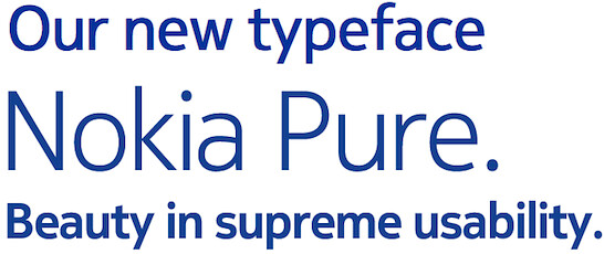
Well it looks pretty decent, we can’t lie. If you’re a real typeface geek, you’ll undoubtedly delight in Nokia’s in-depth and “I can’t believe anybody can write that extensively about a font” post over here.


Sun, Apr 3, 2011
News