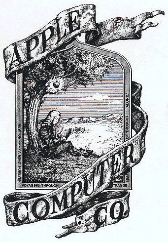
The Newton Crest: 1976-1976
The first Apple logo was designed in 1976 by Ronald Wayne, sometimes referred to as the third co-founder of Apple. The logo depicts Isaac Newton sitting under a tree, an apple dangling precipitously above his head. The phrase on the outside border reads, “Newton… A Mind Forever Voyaging Through Strange Seas of Thought … Alone.”
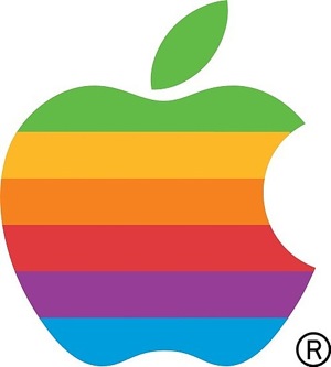
The Rainbow Logo: 1976-1998
Not surprisingly, the above logo only lasted a year before Steve Jobs commissioned graphic designer Rob Janoff to come up with something, oh I don’t know, a little bit more modern. Janoff’s eventual design would go on to become one of the most iconic and recognizable corporate logos in history.
According to Janoff, the “bite” in the Apple logo was originally implemented so that people would know that it represented an apple, and not a tomato. It also lent itself to a nerdy play on words (bite/byte), a fitting reference for a tech company. Quick sidenote: Corporate design sure was a lot simpler in the 70’s. Nowadays, companies like Pepsi spend millions of dollars on logo re-designs that are based on complete BS and new age mumbo jumbo.
As for the rainbow stripes of the logo, Steve Jobs is rumored to have insisted on using a colorful logo as a means to “humanize” the company. Janoff has said that there was no rhyme or reason behind the placement of the colors themselves, noting that he wanted to have green at the top “because that’s where the leaf was.”
The relatively simple origins of the rainbow colored Apple logo hasn’t stopped some from reading a bit too much into what it represents. Jean-Louis Gassée, former Apple executive and founder of BeOS, quipped about the logo:
One of the deep mysteries to me is our logo, the symbol of lust and knowledge, bitten into, all crossed with the colors of the rainbow in the wrong order. You couldn’t dream a more appropriate logo: lust, knowledge, hope and anarchy.
The passion of the French knows no bounds!
The multi-colored Apple logo was in use for 22 years before it was axed by Steve Jobs less than a year after his return to Apple in 1997. In its place was a new logo that did away with the colorful stripes and replaced it with a more modern monochromatic look that has taken on a variety of sizes and colors over the past few years. The overall shape of the logo, however, remains unchanged from its original inception 33 years ago.
The Monochrome Logo: 1998 – Present
TInkering with one of the most recognizable logos in the world wasn’t done simply because Steve Jobs is always looking to change things up. When Jobs returned to Apple in 1997, the company was bleeding money, and Jobs and Co. realized that the Apple logo could be leveraged to their advantage. That meant experimenting with larger logos to make it more prominent. If the shape of the Apple logo was universally recognizable, why not not put it where people could see it?
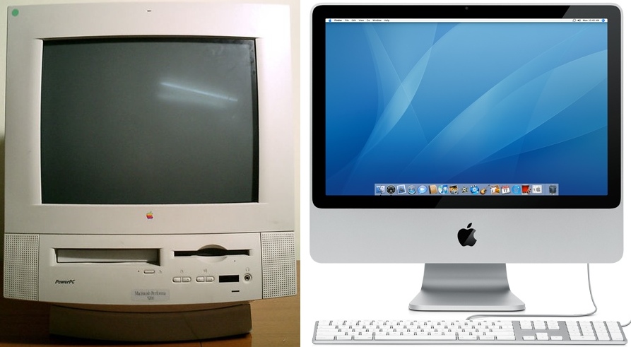
That being the case, placing a large rainbow Apple logo on top of the original Bondi Blue iMac, for example, would have looked silly, childish, and out of place. Not exactly the direction Jobs wanted to lead Apple in. So instead of placing a somewhat minuscule rainbow colored Apple logo on its products, Apple began placing sizeable and Monochrome styled logos on its products in all sorts of places: on top of the original iMac, on the side of the Powermac G3 Tower, and in an assortment of colors on the good ole iBooks. This trend, which began in 1998, continues to this day.
The rainbow colored logo might always be a source of nostalgia for Mac enthusiasts, but the monochrome logo allows Apple greater flexibility when it comes to branding its products. Also, Steve Jobs isn’t exactly the type to get wrapped up in warm fuzzy feelings of nostalgia. When Jobs returned to Apple, he needed to transform Apple’s image from that of a failing company into one capable of churning out sleek and cutting edge products, and he needed a new logo to match. It doesn’t appear likely that Apple will change up its logo again anytime soon, but one thing that will undoubtedly remain is the shape of the logo itself.
Why Apple had to abandon the rainbow
The rainbow logo just wouldn’t fit on the iMac pictured to the right. Rainbow on beige? Alright. Rainbow on metal? Not so much.





April 21st, 2009 at 8:50 am
The multicolor logo was also really expensive and a real bitch to print, especially if they did all six spot colors rather than CMYK.
April 21st, 2009 at 9:53 am
You make it sound like it’s all about style that the rainbow logo isn’t used. There was an article just like this awhile back that explained this in detail. It was about the colors being unusual and expensive to print.
April 21st, 2009 at 10:22 am
You’re leaving out the important step that the bite of the apple was there because the lower case “a” in “apple” used to lodge in there. It’s not there to distinguish it from a tomato.
Here’s an example: http://blogs.s60.com/wp-content/oldposts/browser/images/seriouslyIBM_l-thumb.jpg
April 21st, 2009 at 12:00 pm
Ivan, Janoff himself said that the bite was there so that it could more closely resemble an Apple. Lodging the ‘a’ in between was probably just a byproduct of that.
April 21st, 2009 at 2:42 pm
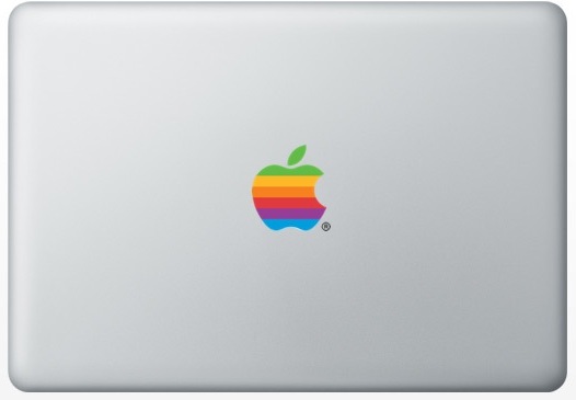
“Imagine if MacBooks looked like this?! I think Apple made the right call.”
Dude, that’s how my Macbook Air looks. Ands its pretty sweet.
Check it out here: http://img99.imageshack.us/img99/1351/photocop.jpg
April 22nd, 2009 at 9:19 am
..and the ‘pepsi’ logo that they spent millions on, just like the ‘at&t’ one, they all look like utter crap, like a kid got loose with a crayon. It’s just gross.
At least the creators in Back to the Future had more creativity than these people that got paid “millions” to create these new awful, gross, looking logos.
I have to say, I will not drink Pepsi, it’s political, and it’s the taste. I don’t like it. Tastes like sugared down flatted Coke.
..and if Coke had changed their logo to something that looked as lame and stupid, I would have to stop drinking Coke too.
March 27th, 2011 at 11:57 am
“imagine if MacBooks looked like this!? I think apple made the right call.”
Talk about personal opinion. Sure, I bet some people would stick their noses up and think the rainbow apple is “queer,” but it’s a classic logo. The original logo is my background right now.
April 6th, 2011 at 11:20 pm
I remember an article at the time of the logo change. The colored logo was a separate piece of plastic that was glued to the (then beige) computers. Changing to monochrome saved the cost of producing the little colored pieces of plastic as well as the step of gluing them onto the case.
Before the embossed gradient shaded logo of today there were also versions in solid colors like black and red that could be used in print advertisements.
While I don’t mind the monochrome logo on my computer, I wish that Apple would still include the six colored decals instead of the white ones when you buy a machine.
October 3rd, 2011 at 10:37 pm
The apple has a bite taken out of it so it could be representing rebellion from god. Also the rainbow is sometimes associated with a serpent. The first apple computer sold for $666.66. Look it up. Interesting though I’m not claiming it’s nefarious or anything.
October 5th, 2011 at 9:44 pm
what about the bite being a tribute to Alvin Turing?
October 6th, 2011 at 1:35 am
RIP Steve jobs
October 6th, 2011 at 1:00 pm
3 Apples Changed the world..1st one seduced Eve..2nd fell on Newton and the 3rd was offered to the world half bitten by him!
R.I.P. Steve Jobs
October 18th, 2011 at 1:13 pm
The apple logo comes from Alan Turing.
It was Steves tribute to the Manchester university scientist.
You need to read up to understand why it was chosen.
October 28th, 2011 at 12:29 pm
@Ivan, and anyone else misinformed,
That is Incorrect, the bite on the apple doesn’t symbolize anything but Steve’s decision to go with it. He was presented with two apples, one with and one without the bite mark, and so he decided to go with the bite-marked apple because he thought the regular apple looked to much like a “cherry.”
I would know, I just read that section in his biography.