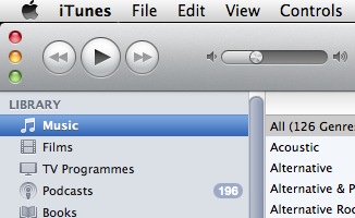
Rever to Saved astutely points out a number of curious UI changes in the newly released iTunes 10. First and foremost, the grey shading on the left sidebar is particularly egregious.
iTunes previously coloured its sidebar items. This enabled you to—without thinking—associate certain items with certain colours; even if you didn’t do this, each item was differentiated. Now, you have to think before you click, and the usability of this area of the app has been substantially reduced.
What gives, Apple?


September 2nd, 2010 at 5:58 pm
The first thing that comes to my mind when i see the greyed items is that they are disabled.